

Practitioner analytics
Practitioner analytics show whether the practice is growing month on month, and whether that growth is shared evenly across the team or carried by one or two practitioners — without building the comparison yourself in a spreadsheet.
Choosing your window
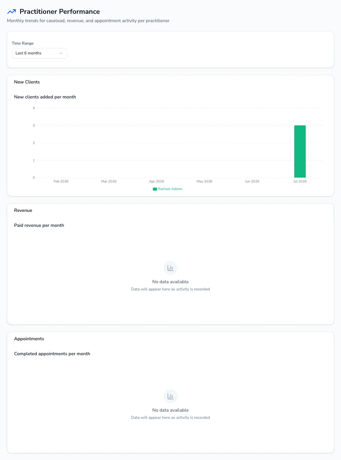
Section titled “Choosing your window”Pick Last 3, 6 or 12 months and all three charts below update together.
The three trends
Section titled “The three trends”Each chart shows a bar for each practitioner within each month, grouped side by side so you can compare them:
- New clients — caseload growth per practitioner, per month.
- Revenue — paid revenue in £ per practitioner, per month.
- Appointments — completed sessions per practitioner, per month.
Hover any bar on a chart for the exact figure and practitioner.
Who it’s for
Section titled “Who it’s for”This is a practice-oversight view for owners and managers. On a team practice it shows every practitioner side by side; on a solo practice you’ll just see your own trend over time — still a useful way to check your own caseload, income and activity are heading the right way.